Files Management UI Components
Before you can use these UI Components, please do the basic setup.
<FileUpload/>
Description
The <FileUpload/> component represents a button which opens a file selector and starts uploads. Please refer to
the files feature guide for more information and instructions. You can see this component in action on
Storybook (opens in a new tab).

Integration
This component can be used in various ways. A good way to learn about it, is to look into the implementation of the Kickstarter: /src/components/file/upload-file.tsx (opens in a new tab)
You can easily add the <FileUpload/> component to your application by adding this code snippet to your component:
<FileUpload
    accept={["image/*"]}
    fileCategory="USER_FILES"
    onUploadSuccess={({url, id, ...rest}) => {
        console.log({id, url});
        // optional: send file ID to server-side by calling your API
    }}
/>;
Success handler
After the file was uploaded, the onUploadSuccess handler is called. This way you can send the file ID to your backend
application, which is required in one of these cases:
- you want to relate the file to another object
- you want to change the visibility of the file (e.g. from "public" to "private").
Read more about these concepts in the tutorials section.
Props
The <FileUpload/> component has multiple props:
| Prop | Type | Description | Default |
|---|---|---|---|
| accept | string[] | List of mime-types that the drop zone should support | All |
| fileCategory | string | File category key defined in the console | |
| onUploadFail | function | Callback, invoked when upload gets failed | |
| onUploadSuccess | function | Callback, invoked when upload gets successful |
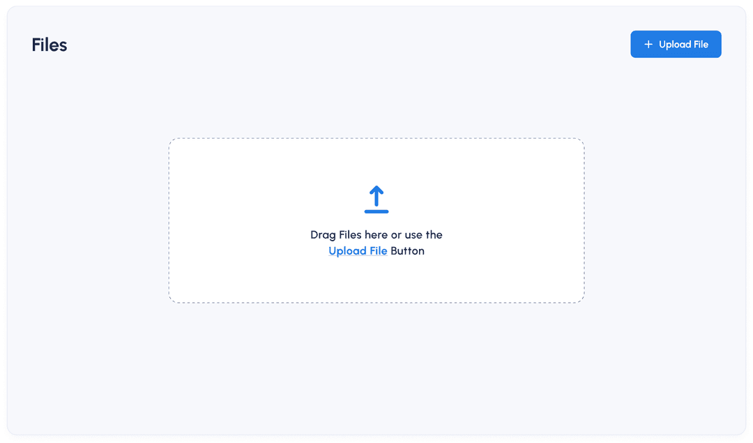
<FileDropzone/>
Description
The <FileDropzone/> component represents an area on your application where users can drag and drop files to be
uploaded. Please refer to the files feature guide for more information and instructions. See this component in
action on Storybook (opens in a new tab).
Integration
You can easily add the <FileDropzone/> component to your application by using this code:
<FileDropzone/>Props
The props of the <FileDropzone/> component are the same as for <FileUpload/>.
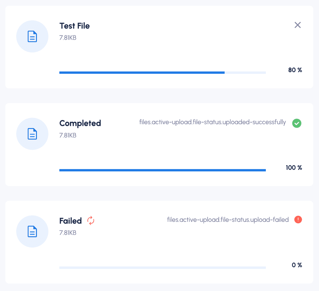
<FileActiveUploads/>
Description
The <FileActiveUploads/> component shows a progress bar of all active files uploads. Users can abort and restart
uploads. This component is typically shown on the bottom right corner of your application but you can place it wherever
you like.
See this component in action on Storybook (opens in a new tab).
Integration
To add the <FileActiveUploads/> component to your application, you can use the following code:
<FileActiveUploads
    files={[]}
    onCancel={function noRefCheck() {
    }}
    onRestart={function noRefCheck() {
    }}
/>
Props
| Prop | Type | Description | Default |
|---|---|---|---|
files | array | List of files that are currently uploaded. Each file is represented as an object, see below. | [] |
files.abortController | AbortController | Instance of Abort controller object that allows you to abort one or more DOM requests as and when desired. | undefined |
name | String | Name of the file | |
percentage | Number | File percentage which was uploaded | |
size | Number | Size of file in bytes | |
status | ActiveUploadStatusEnum | Status of the file | UPLOADING |
temporaryId | String | Unique Identifier for the files list | |
uploadUrl | String | Upload URL, to upload file | |
onCancel | function | Callback function which is triggered when User Clicks on Cancel (X) Icon, contains logic on how to cancel file upload | |
onRestart | function | Callback function which is triggered when User Clicks on restart Icon, contains logic on how to restart file upload |